Day 2: Structure and styling
For the things we have to learn before we can do them, we learn by doing them.
Yesterday we set out to build this website in 3 days time. We already learned that websites are in essence made using three languages, namely HTML, CSS and JavaScript. Now that we’ve gotten familiar with the building blocks of a website, the time has come to build one of our own. Today we’ll focus on the HTML and CSS of our website. But before we go ahead and do that, let’s get ourselves organized…
Getting organized
Getting organized is the first and most important part of building websites. Professional web developers do not succumb to the temptation of creating a mess in order to move more quickly. Instead, they start with the end-goal in mind and organize themselves accordingly. The advantages become clear when you start writing CSS for a decently sized website. Given the characteristics of the language, CSS files can get very bloated very fast. In order to keep our CSS code easy to read and maintain, we thus have no choice but to think out an effective organization for it. The approach we’ll use is modular in nature. Much like a chef has his ingredients lined up ready to go, we’ll have our CSS file cut up into multiple files that are readily available to our website. When everything is in its designated place, then we are able to think and work efficiently. Here’s our mise en place:
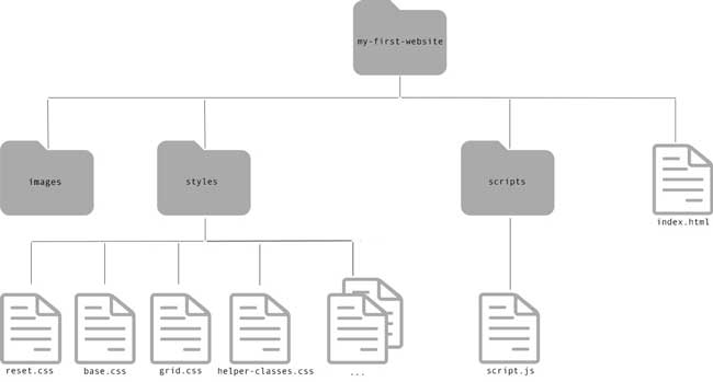
Create a folder on your computer named "my-first-website". This will be the workspace for your website. In this folder, create your "index.html" file and add the following content: Now create your CSS files in accordance with the paths specified in the href attribute of your link tags. This means creating a subfolder named "styles" in your workspace, in which you place eight (empty) CSS files with names matching those in the link tags. Likewise, create an empty JavaScript file named "script.js" in a subfolder named "scripts". Finally, add an empty subfolder named "images" in your workspace. This is where you will house your images later on. Your workspace directory should thus look like this:
Now open your "my-first-website" folder in your code editor (e.g. Sublime Text). From now on, we’ll be working in our code editor.
Each CSS file in our workspace is aimed at either styling a specific structural module in our website, or grouping CSS rules that contribute to a specific task in the overall styling of our website. Laying the groundwork for the styling of our website is the first task we’ll address, and for that we’ll use our "reset.css" file.
Maybe you remember from yesterday’s article that browsers have built-in default styling rules to make unstyled websites appear more legible. Header elements for example are styled bolder and bigger than paragraphs by most browsers, and often default top and bottom margins are applied. These default styles can vary from browser to browser. Therefore, if we want our website to look the same in every browser, it’s a good idea to reset the styling of all HTML elements to a consistent baseline before we start adding our own custom styles. Since there are many CSS resets freely available on the internet, it would be a waste of time to write this CSS ourselves. A nice CSS reset for zeroing out styles on all elements is the one from Eric Meyer. I’ve tweaked this CSS reset a little bit so that it matches the specific needs of our website. Now let’s use it.
Copy paste Eric Meyer’s CSS reset code it in your "reset.css" file; You can test your CSS reset by adding a h1 header and a paragraph to your "index.html". Both should have the same styling in your browser. If not, start debugging!
When you take a closer look at this CSS reset, you’ll notice there are a couple of things we can learn from it. First, there are a lot of HTML tags we haven’t seen before. Take a minute to glance through them. No need to memorize them all! Another thing to note is the use of comma’s in our CSS selectors. The comma in a CSS selector separates multiple selectors that have the same style. In other words, all CSS declarations in between curly braces apply to each of the comma-separated HTML tags in front of them. Finally, note the presence of CSS comments. CSS comments are a handy way of adding helpful notes and hints to your CSS, thereby making sure that people who read your code understand what’s going on.. By using comments to make your stylesheets more readable, your CSS will be easier to maintain in the future. A CSS comment is added by enclosing it between /* and */ characters. Everything in our CSS that’s in between these opening and closing comment characters will be ignored by the browser, and so will the comment characters themselves.
Now that we have turned off browser default styles, we can start layering our own styles on our HTML elements. Let’s make a rule for ourselves to use our "base.css" file for styling HTML tags only, and our remaining CSS files for targeting classes only. This way we get a logical progression in the styling of our website. First, we reset browser default styling in our "reset.css". Subsequently, we layer on our own default styling for HTML tags in our "base.css", and then finally, we have the opportunity to layer on element-specific styles by targeting element class attributes in the appropriate CSS files. Since the browser processes our CSS files one by one from top to bottom, it should be clear that the order in which we declare the link tags in the head of our "index.html" is of great importance (see CSS specificity on day 1).
The CSS box model
Now before we go ahead and build up our website, there’s just one more concept you need to familiarize yourself with, and that is that every HTML element is a rectangular box. We can represent this box like so;
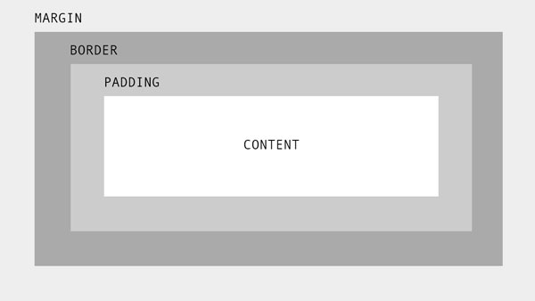
We’ve already seen that we can manipulate the margins of this box using CSS. Margins don’t affect the size of the box itself, but they affect the distance of the box in respect to the other boxes in our website, and thus they are an important part of the CSS box model. Evidently, we can also use CSS to adjust the padding and border properties of our HTML elements. Where it gets confusing is when we also declare specific height and/or width properties on those elements. If we would for example setup our CSS to give an element a padding of 20px and a width of 100px, then the perceived width of this element in our browser would be 120px. This is totally counter-intuitive since this perceived width does not match the width property in our CSS. There is, however, the CSS property box-sizing which conveniently allows us to change the box model so that an element's specified width and height aren't affected by its padding or borders. It’s common practice to apply this rule to all elements.
Insert this piece of code in your "base.css" file; It could be argued that this piece of code belongs in our "reset.css" rather than our "base.css" file. You say to-may-to, I say to-mah-to. Let’s move on…
Note that the asterisk is a special CSS selector that simply targets all elements. So from now on, the width and height properties in our CSS include content, padding and border, but not the margin. Neat indeed! But don’t you start thinking that all boxes are created equal now… Because they’re not!
Based on their default behavior as a box in the browser, we can distinguish 3 types of HTML elements. There are block elements, which by default take up the full width of their parent element and enforce line breaks. The h1 header and paragraph elements we used yesterday are examples of block elements. Then there are inline elements. Consider you want a word in a paragraph marked up as a link to another website. We don’t want a line break to be enforced on that word right? The link tag is therefore an example of an inline element, which is by default just as wide as its content and doesn’t enforce a line break. Don’t try to set a top margin, bottom margin, height, or width on an inline element, ‘cause it’s not going to work! Finally there are inline-block elements, which differ only in respect to inline elements in that their margins are all adjustable, just as their width and height. An example of such an element would be an image.
Walking the walk
Alright, we’ve spent approximately one and a half day talking about website development. We’ve learned a lot, and you’re a real trooper for still hanging in there. But although being knowledgeable is mighty fine, it’s of no value until you put this into practice. In other words, it’s high time we get our hands dirty. So hold on to your hats, because we’re going to move fast in building something to be proud of by the end of the day.
Looking at the beginner page of our website, we can distinguish six sections. Here they are from top to bottom:
-
Header
contains navigation bar and twitter logo -> styled mainly in "header.css" file -
Hero
contains page title and web languages logo image -> styled mainly in "hero.css" file -
Main content section
contains subtitle, some paragraphs and a button -> styled mainly in "base.css" file -
Devices image
contains image of different devices on which our website will shine -> styled mainly in "helper-classes.css" file -
Tab section
contains subtitle, paragraph and tabs -> styled mainly in "tabs.css" file -
Footer
contains website info -> styled mainly in "footer.css" file
On a side note, the term "hero" is commonly used for a website’s main banner. It is believed to stem from the marketing industry, where "hero" denotes the main focal point of an advertisement.
Now let’s build them sections one by one…
Header
First notice that the header bar covers the full width of the page, but the content of the navigation bar is positioned in the middle. Since this same pattern of centered content is returning in other sections of the page, it would be wise to create a wrapper for this content that can be reused in the other sections. For this purpose, we’ll use a block element (any semantically meaningful block element will do) decorated with the class content-wrapper. We’ll then target this content-wrapper class from our CSS to position it in the middle of the page.
The HTML elements we’ll use to construct our header are <header>, <nav> and <a>, which respectively define the boundaries of the header, the wrapper for our navigation links and the links themselves (including the twitter icon). We’re going to decorate them all with meaningful classnames too, so that we can target them from our "header.css" Here’s the HTML for our header:
Copy paste this HTML snippet into the body tag of your "index.html" file:
Now take a long, good look at this HTML snippet. Note that we have used the absolute minimum number of HTML tags necessary to describe the structure and meaning of the header content. If you know that the <header> and <nav> tags are block elements, and the <a> tag is an inline element, then try to imagine how their respective boxes will be positioned in the browser. Open your "index.html" in the browser and use its web development tools to inspect these elements! We already know what the content-wrapper class is for. How can we use the other classes to style our HTML elements in accordance with the design we’re after? Don’t worry about the absent twitter bird just yet, we’ll fix that in a minute.
The first thing we’ll address is the content-wrapper. The content-wrapper is a block element and thus has a default width of 100%. We can easily make a block element smaller by setting a CSS width property for it, and then center it by setting its left and right margins to auto. The content-wrapper class will be used throughout multiple sections of our website, so it makes sense to put this code in the generic CSS file named "grid.css".
Add this CSS code to your "grid.css" file:
When you refresh your browser, you’ll see that the navigation links have moved away from the left side of your browser to a more centered position. When you inspect the <nav> element with your browser’s web development tools, you’ll see that it’s perfectly centered. All content within it will now be positioned in the middle of the page. Easy enough, right? Note that this code is not going to cut it on smaller (mobile) devices, but we’ll fix that later on.
Next up, the twitter bird! Did you notice the fa, fa-twitter and fa-2x classes on our last link element? These classes will be used by our CSS to style that link element, so that it gets a twitter bird as its content. This will obviously require some advanced CSS trickery way beyond the scope of this series, so we’re going to use an external CSS file to do it for us. To import this CSS file, add the following line of code to the <head> of your "index.html": <link rel="stylesheet" href="https://maxcdn.bootstrapcdn.com/font-awesome/4.3.0/css/font-awesome.min.css">. Refresh your browser and the twitter bird is in place. Mind = blown! With special thanks to Font Awesome, the iconic font, and CSS toolkit…
Still, the color of our twitter bird is off. And what’s that line on the bottom doing there? Well, these are default browser styles applied to link elements, which we’ll have to overwrite. Looking at other links throughout our example website, you’ll notice that most of them have a light blue color and none of them are underlined. It thus makes sense to style link elements this way in our "base.css" file:
Add this CSS code to your "base.css" file:
Note that the color property has a hex code value. On day one of this series, we used the color name red to change the color of highlighted text. Obviously, the list of color names to choose from is limited. A more flexible (and popular) way of specifying colors with CSS is via hex codes, where the first two digits represent the red, the next two the green, and the last two the blue. Mixing these three colors together in different proportions gives us a huge color palette to work with. In the hexadecimal system, numbers (0-9) team up with letters (A-F) to create 16 possibilities per digit: [0,1,2,3,4,5,6,7,8,9,A,B,C,D,E,F]. And so, black would be represented by #000000, white by #FFFFFF, red by #FF0000, green by #00FF00, and blue by #0000FF. Looking at the hex code we’re using to color our links, we can see there’s a lot of blue (ED) mixed in, but also a substantial amount of red (64) and green (95). The result is a light blue, much like the twitter brand color.
Now blow the trumpet and bang the drum, because our header… still looks like crap. So let’s bring out the big guns and fill up that "header.css" file with some header-specific CSS rules. Here’s the code:
Fill up your "header.css" file with the following CSS:
Now that’s better! Can you figure out the purpose of each CSS rule by yourself? If you have doubts about the effect of a certain CSS property, just delete it and see what happens in the browser. If you have doubts about the syntax of a CSS property, just google it (I had to google the box-shadow syntax myself). Note that we’ve shown here that the default inline, inline-block, or block behavior of an element are interchangeable via the display property. In our case, we’ve changed the inline nav-item link elements into inline-block elements, so as to enable us to specify their height. Note also that it’s good practice to give small clickable elements some padding (rather than margins), thereby increasing their clickable surface. With everything you’ve learned so far, I consider the rest of this CSS code to be self-evident. Let’s move on…
Hero
Since all our hero content is centered horizontally, it’s tempting to think we need a content-wrapper in our hero like we did in our header. However, if you think about it, centering elements in respect to either a content-wrapper or a full-width element has exactly the same effect. We can thus omit the content-wrapper in our hero markup.
Add this HTML snippet right after the header closing tag in your "index.html" file:
Note that the button in our hero is actually linking to another website, which is why an <a> tag is semantically more correct here than the perhaps more obvious <button> tag.
Looking at the rendered hero markup in your browser, the first thing you’ll notice is the missing image. As specified in the <img>’s src attribute, the browser is desperately looking for an image named "logo.png" in the images folder. You can help out the browser by downloading the image here, and then placing this (correctly named) image in the images folder of your workspace. If you’d like to use your own image instead, then that’s just fine by me. Just make sure that it is no bigger than needed, because images take up an awful lot of bandwidth.
Assuming that the h1 header will have the same font properties on all our webpages, it’s best to define these in our "base.css" file.
Add this generic CSS rule to your "base.css" file:
Now let’s focus on horizontally centering all hero content. We have already learned from our content-wrapper that we can center block elements by specifying their width and setting their left and right margins to auto, so our h1 element is covered. Since our image element (inline-block element) is supposed to enforce a line break, we might as well make it a block element too. Here are the hero-specific CSS rules for our h1 header and image element:
Add these CSS rules to your "hero.css" file:
Note that we’re using a combination of the width and max-width properties to make elements scale nicely on smaller devices, but prevent them from scaling out of proportion on larger devices.
Although our block elements are now centered nicely, our h1 header border makes it clear that its content is not. Horizontally centering text, inline and inline-block elements requires another, more straightforward approach than block elements, namely setting a text-align property on its parent…
Add this CSS rule to your "hero.css" file: Note that the text-align property gets inherited by the h1 element.
Now that’s looking better! But did you notice that the shadow on the header has disappeared? That’s because our hero is stacked on top of it. And since we’ve now specified a background color for our hero, it’s actually covering it. We can fix this by moving the header element upwards with the z-index property. Note that this property works only on positioned elements. So if you want, you can already bring back the header shadow by styling the header element, like so: position:relative; z-index:999;. Later on, when styling the header to stay fixed to the top of the screen while scrolling, we’re going to update this code again.
All that’s left for us to do now regarding the hero is to style its button. We could do that ourselves, and it wouldn’t be that difficult either. There is, however, an even easier way called Bootstrap. Much like Font Awesome provided us with CSS to style our twitter bird in the header, Bootstrap can provide us with CSS to style commonly used components throughout the web. All we have to do is import the Bootstrap CSS and decorate our elements with the targeted classes. The classes that Bootstrap targets for styling a success button (btn, btn-success, and btn-lg) are already in place. All that’s left for us to do is import the Bootstrap CSS file by adding the following link tag to the <head> of our "index.html" file: <link rel="stylesheet" href="https://maxcdn.bootstrapcdn.com/bootstrap/3.3.4/css/bootstrap.min.css">. Impressive, right? Styling buttons is just a tiny little fraction of what Bootstrap can do for us. It’s actually kind of a waste importing such a huge CSS file, just to use so little of its potential. The purpose of this course is only showing you how Bootstrap works. If you decide to use it in your own projects, then use it enough so that the CSS file import is justified. Also make sure you always import Bootstrap CSS before your own stylesheets, meaning that its link tag in the <head> should precede the others. That way, it’s easier to overwrite any Bootstrap styling we didn’t ask for, like for instance underlining links that are hovered over by the mouse. You can now fix this by adding a:hover { text-decoration: none; } to your "base.css" file.
Main content section
I hope we can agree that the main content section is not a component in itself like the header and hero. The subtitle (<h2>) and paragraphs within are indeed very generic in the sense that they’re not specific to any component. Thus, we can best style them in our "base.css" file. The button styling is already taken care of by Bootstrap. Here’s the required HTML and CSS for our main content section:
Add the following HTML snippet to your "index.html" file:
Add the following CSS snippet to your "base.css" file:
Note that the CSS selector h2 + p targets any paragraph element that’s directly preceded by a h2 header element, just as the p + button selector targets any button element that is directly preceded by a paragraph.
Not too shabby. But the font doesn’t look quite right, now does it? When you take a close look at our example website, you’ll notice that there are two different font families in play. Paragraphs are presented in one font family, and all other text in another. It’s becoming very clear now that the font used throughout our website is not matching those at all. The time has come to specify the appropriate fonts in our CSS. Doing this, we have to take into account that browsers can only actually use fonts that are available to them. It is therefore important that we also specify a fallback font whose presence is safe to assume on any computer. The obvious place to add these font family declarations is our "base.css" file. Add the following CSS declaration to the CSS rule for paragraphs: font-family: "Helvetica Neue", Helvetica, Arial, sans-serif;. The browser will now go through the comma-separated font family list from left to right, applying the first font it finds on your computer to all paragraphs in your website. Even when it has to fallback to Arial, it still looks ok! And with that, our paragraphs are covered. We can now easily specify a font for all other text by targeting the body element. All nested elements will inherit this font setting, except for paragraphs that indeed overwrite it with a setting of their own. Let's use "Oswald" as our default font:
Specify a default font for your website by adding the following CSS rule to your "base.css" file:
There are not a lot of fallback fonts specified here, and there are not a lot of computers that support "Oswald" either! But don’t you worry, cause with the help of google fonts, we’re going to instruct the browser to download "Oswald" for us. You can do this by adding the following line to the <head> in your "index.html": <link href='https://fonts.googleapis.com/css?family=Oswald:400,700" rel='stylesheet" type=‘text/css’>. Our website requires two font-weight variations (400 which is the default & 700) from "Oswald", and you can derive from this link that the browser is instructed to download both. Moving on…
Devices image
Since we can follow exactly the same protocol here as we did for the hero image, we can be brief about this section. Download the image here, put it in your images folder under the name "devices.jpg", and add the following line to the <body> of your "index.html" file: <img class="image-wide" src="images/devices.jpg">. The only question that remains is which CSS file to add the accompanying CSS rules to. Surely, this section is not a component, since it consists of one HTML element only. Neither is it generic enough to style on tag level in our "base.css". We’ll thus put its styling in "helper-classes.css", a file made especially for targeting specific component-independent classes. Hah! And in my opinion, we should also remove the h2 + p { … } CSS rule from our "base.css" file, and target an intro-text class in the "helper-classes.css" instead. Do you agree? Anyway, here’s the CSS for our "devices image" section:
Add the following CSS to your "helper-classes.css" file:
Note that we’re using exactly the same CSS properties we used for styling the hero image. The properties used here differ only in their respective values, bringing about a much wider image on desktop computers.
Tab section
What we have here is a subtitle and intro paragraph whose styling we already covered, and then there’s a tab component whose styling we still need to insert in the "tabs.css" file. The tab component consists of three tab links and their three corresponding tab panes. Let’s have a look at the markup…
Add the tab section HTML to the body tag in your "index.html" file:
There are two HTML tags here that we didn’t use before. First, there’s <h3>, which represents a subtitle one level lower than our <h2> subtitles. We’re going to style it in our "base.css" file.
Style the h3 subtitle in your "base.css" like so:
The other HTML tag in our tab component we haven’t used before is the very generic <div> tag. It defines a division block element and is probably the most used HTML tag throughout the web. If I would have written this series a couple of years ago, there would be plenty more <div> tags in our website too. With the inception of HTML5, however, many semantically more appropriate tags like <header>, <footer>, <nav>, <section>, etc… were introduced, enabling us to write clearer and more descriptive code. With these new semantic tags, screen readers can also better examine the HTML document and create an improved experience for users. But don’t you get too hung up on semantics either. There’s nothing wrong with using <div> tags in your HTML. In our case, for us to properly layout the tab component with CSS, it’s absolutely required that we wrap the tab panes and their content in block elements. No meaningful HTML tag exists for this purpose, so the <div> tag is the way to go here.
Looking at our tab component in the browser, you can see that all three tab panes are displayed. What we want though, is that only one tab pane is visible, namely the one that’s decorated with a class name active. We can then use JavaScript to move this active class from one tab pane to another according to which tab link was clicked. For now, let’s just update our CSS so that only the first (active) pane is displayed. And while we’re at it, let’s add some padding to these tab panes as well…
Add the following CSS to your "tabs.css" file:
For styling the tab links, we’ll need to tinker with their border properties. First of, there’s a bottom border on their tab-links wrapper element. Then there’s also a left, top, and right border on the active tab-links-item element, but apparently no bottom border. We thus need to hide the tab-links wrapper border below the active tab-links-item element. There are several ways to do it, but we are going to give the active tab link a white background and then move it down 1 pixel over the tab-links border. We’ll finish up the tab link styling by polishing of those top border corners with the border-radius property.
Style your tab links by adding this CSS to your "tabs.css" file:
We now have a tab component that’s seemingly forever stuck on the first tab. However, we’ve constructed the tabs in such a way that it requires minimum effort to switch between them. All it takes is to transfer the active class between tab elements. We can already do this manually in our code, but tomorrow we’ll write some JavaScript that will take care of this for us.
Footer
Phew, last component… So what do we have here? We have some centered text like we had in the hero. We also have a footnote on the bottom right of the footer. The footer will thus — contrary to the hero — require a content wrapper to position this footnote against. Here’s the markup:
Add the footer HTML to the body tag in your "index.html" file:
The <span> tag is new to us. You can think of the <span> tag as the inline counterpart of the <div> tag. Its only purpose is to provide a hook to a part of inline content, so that we can for instance target it for styling purposes. The first <span> tag is used here as a hook for Font Awesome to insert a heart icon. The second is used to style (position and font-size) our footnote.
In order to position the footnote against the content wrapper, we’re going to have to set its position property to absolute. We can then use the left, right, top and bottom properties to position the footnote relative to its first containing element that has its position property set to a non-default value. In our case, it’s the content wrapper, and it will have its position property set to relative. The rest of the footer styling is self-evident for a pro like you, so let’s just insert it into the "footer.css" file.
Add the following CSS to your "footer.css" file:
With that, all content has been added to our website. And it’s looking great too! But before we call it a day, let’s give our website an ultra professional boost with two little tweaks.
Finishing touches
You’ve probably noticed the sticky header in our example website. Sticky headers enable quicker navigation, especially when dealing with long pages. It eliminates the requirement for a user to scroll back up to be navigated elsewhere. To achieve this effect, we’re going to set the position property of the header to fixed and then position it at the top of the page by setting its top property to zero. If you try only this, you’ll see weird stuff happening to the header. First, the header is no longer taking up the full width of the page, and second, the hero has jumped to the top of the page, so that it’s seemingly positioned under the header. Both these phenomena can be explained by the fact that the header has actually been taken out of the flow of the web page by the position: fixed; declaration. Its width is thus no longer determined by its parent element, and the hero is now the first element taking up space in the web page. We can fix these issues by respectively setting the <header>’s width explicitly to 100%, and inserting some padding to the top of the <body> element. Here’s the updated CSS rule for our header:
Update the header CSS rule in your "header.css" file like so: Note that we’ve also set a white background to the header, so that the underlying elements don’t show through.
Now all that’s left for us to do is to push down the hero a bit. In your "base.css" file, update the CSS rule that targets the <body> tag with the padding-top: 60px; declaration, and done is done! Until you visit the website from a mobile device…
Ok, it’s time we had "the talk". Resize your browser window so that it becomes smaller than 750px in width (not coincidentally the width of your content wrapper), and watch part of your website fall off screen. Ugh! This is how your mobile users would experience your website as it is. And since the use of mobile devices has exploded over the last couple of years, we definitely need to take action here! Cue "Responsive Web Design" (RWD). The goal of RWD is to build web pages that detect the visitor’s screen size and change the layout accordingly. In our case, we want to detect if our website is viewed on a screen smaller than 750px, and act upon it by changing the width of the content wrapper to a 100%. Or if we take the opposite approach — the mobile first approach — we want our content wrapper to be full-width, unless the screen size exceeds 749px, in which case we want it centered with a fixed width of 750px. Detecting screen sizes in CSS is made possible by so-called media queries. Let’s use one to fix our issue.
Replace the content of your "grid.css" file with the following:
In this piece of code, everything that’s wrapped within the @media (min-width: 750px) { } curly braces will only be executed in screens that are at least 750px in width. Our first CSS rule thus has effect on smaller devices only, making our content wrapper stretch to full screen width on them. We’ve also applied a 15px left and right padding, so that its content doesn’t touch the borders of the screen. Viewed on a large enough screen, the width property of the content wrapper gets overwritten to 750px, and its left and right margins are set to auto so that it is centered. Note that the padding property does not get overwritten, and thus still stands on larger devices too, which is totally fine.
And with that, our website has become fully responsive. All that’s left for us to do now is to add some JavaScript action to it, and publish it for the whole world to admire. Let’s do that tomorrow…